Composeum

Showing off composition notebooks, hacks n' mods, and people who use them.

Monday, June 1, 2009

Our Notebooks #004 ["The Mic"]


Stephanie R. posted these pics on Flickr. She says:
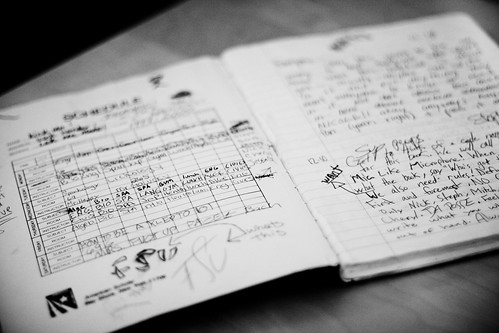
this is the notebook we used to pass around freshman year of high school which was about, oh, 8 years ago! I think we had 6 people writing in it at one point & passed it around for about a month until we stopped writing in it all together. Mic = the Microphone. Lol, good times.
This is just the kind of notebook I like to hear about. Those of us of a certain age (*cough*) remember these kinds of notebooks as the precursor to texting, facebook and other social media. Before all this tweeter and facespace digimahoozits, we had rugged little analog books like these to write our silly notes to each other.

Did your friends have a notebook like this when you were in school?

Labels:

Monday, May 18, 2009

Our Notebooks #003 [Quentin Hudspeth]


Quentin left this very thorough comment on a post to my original call for submissions.
I use composition notebooks pretty much exclusively. I flirted with the moleskine jobbies when they started appearing in Borders, but they seemed like a waste of money. I need utilitarian notebooks to work with, not fine china.
[...]
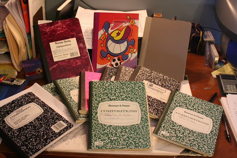
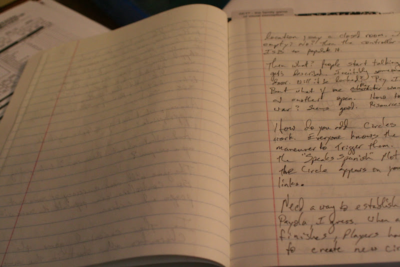
The nice thing about composition books is that I can afford to have one for each project. Or more. Stories from the Shelter is up to seven volumes now (the ones fanned out on the bottom). I make notes in a journal style, talking to myself and working out kinks and such, so I can get pretty verbose.

Many of the books I have are Roaring Spring hand me downs from my mother-in-law from when she retired from teaching first grade. They have pretty good paper, probably a little thinner than 20 lb. It takes ink well from rollerball or fountain pen, but you can see through a bit to the writing on the other side, and you can "read" the reverse side with your fingertips. The paper is well-bleached, though, and the color has been stable for a good five years or so.


[...]
Of the books I can find most readily, I like Mead's offering. Ink shows through the paper a little more than for the grey B&P, and there is a little braille when I use a rollerball (one of the reasons I've switched to fountain is that it forces me not to push so hard).


You can find more images of Quentin's notebooks on picasa. Thanks again, Quentin!

If you'd like your notebook featured, please leave a comment with a link to your images or blog post!

Labels: ,

Monday, May 11, 2009

Our Notebooks #002


This was one of those poorly managed notebooks that didn’t even get a proper title on the front cover. It is a sad state of affairs, I must say. However, it served one very noteworthy purpose as my sketchbook for the new Delta Community Credit Union logo. They were moving away from a connection to Delta Airlines to stand on their own unique brand.

Logos are a tough job and probably the hardest thing for a designer to do. One of the tricks I’ve found helpful is to just list out a bunch of words in free association and see if any of them strike a visual note. I get a lot of puns and clichés out of the way first. It’s easy to get discouraged right at the beginning because it feels like all your ideas are crap, but just keep working at it and you’ll come across something interesting.

My favorite logos have at least two layers of visual metaphor. In this case, I was playing on the idea of a delta as a triangular shape. I also wanted to reference Delta’s connection to aviation, by suggesting natural graceful curves rather than mechanical flight. I combined triangles and curves into a variety of shapes as you can see here. Butterflies were an influence right from the get-go. Long story short, this was the final logo! If you’re driving around Atlanta, you’ll see it on signs n’ stuff.


Having a compy around was really helpful. When you already have marked lines on your page, it stops being this totally precious object and you can really hack away at a concept without feeling like it has to be perfect the first time.

Labels:

Monday, May 4, 2009

Our Notebooks #001


Notebooks are funny things. We keep them around a while expend a lot of mental energy and physical time on them, but usually leave half the pages blank and unadorned with our various scribbles. In order to give these little artifacts the attention they deserve, I'm starting an ongoing series featuring our notebooks and any noteworthy (heh) things about them.

So to kick things off, I'd expose my own small library of notebooks that I've got lying around.

Notebook #001


Each of these have titles on the cover that ostensibly describe their contents, but I am very undisciplined. I'll start one notebook on one subject, then in a moment of crisis in which I need to scribble down an idea, I'll just grab the nearest scrap of paper I can find. Thus, my "graphic design" notebook has this page where I scribbled the earliest ideas for Do: Pilgrims of the Flying Temple.

Back then, I was way more influenced by Stargate and Planescape than Avatar the Last Airbender. I had this notion of a stargate cult in the distant, post-apocalyptic future finding the ruins of Cheyenne mountain and the old Stargate Command compound. That quickly morphed into a focus on the journey of a small group of wanderers, helping people on new worlds each episode.

You can see notes here mentioning something about "Adversary" which was the analogue for Stargate's System Lords occupying various worlds and generally being nasty despots. Maps were to play a big part in the flow of play as well, both as character sheets and as a game board. Plus, there was this weird "self/universe" dichotomy that never really went anywhere beyond this odd symbol system.

I may still use that set of icons for something, but for now they'll rest along with the other notes from way back when.

Labels: