Composeum

Showing off composition notebooks, hacks n' mods, and people who use them.

Friday, May 15, 2009

Numbered Pages [Mods]


You may have seen some scientific notebooks floating around with numbered pages. Great idea, right?

You can keep your handy-dandy composition notebook in working order by just writing the numbers in the corner of each page like Quentin Hudspeth demonstrates here. This especially nice with this little trick:

I also suggest leaving a couple of blank pages at the front for a table of contents.


This is especially helpful when your work spans multiple volumes and you need to find that obscure bit of information from twelve revisions ago that no longer exists in digital form. Of course, a TOC requires you to number the blasted pages. If only someone would publish a page-numbered comp book, that would be cool. It might be worth an extra dollar on the price.
I'm a frugal sort, so I don't mind numbering my pages by hand as I go, especially if it saves me 15 bucks from a more pricey scientific notebook.

Thanks Quentin!

Labels: ,

Wednesday, May 13, 2009

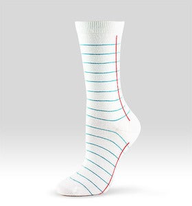
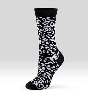
Composition and Notebook Socks [PopComps]


For your favorite compy fan, check out these socks from ashidashi.

Labels:

Monday, May 11, 2009

Our Notebooks #002


This was one of those poorly managed notebooks that didn’t even get a proper title on the front cover. It is a sad state of affairs, I must say. However, it served one very noteworthy purpose as my sketchbook for the new Delta Community Credit Union logo. They were moving away from a connection to Delta Airlines to stand on their own unique brand.

Logos are a tough job and probably the hardest thing for a designer to do. One of the tricks I’ve found helpful is to just list out a bunch of words in free association and see if any of them strike a visual note. I get a lot of puns and clichés out of the way first. It’s easy to get discouraged right at the beginning because it feels like all your ideas are crap, but just keep working at it and you’ll come across something interesting.

My favorite logos have at least two layers of visual metaphor. In this case, I was playing on the idea of a delta as a triangular shape. I also wanted to reference Delta’s connection to aviation, by suggesting natural graceful curves rather than mechanical flight. I combined triangles and curves into a variety of shapes as you can see here. Butterflies were an influence right from the get-go. Long story short, this was the final logo! If you’re driving around Atlanta, you’ll see it on signs n’ stuff.


Having a compy around was really helpful. When you already have marked lines on your page, it stops being this totally precious object and you can really hack away at a concept without feeling like it has to be perfect the first time.

Labels: